
BLXCKGXLD
“Black History, Black Love, and Black Lives — about Hope, Truth, and Redemption.”
01 — WHAT THIS BRAND IS
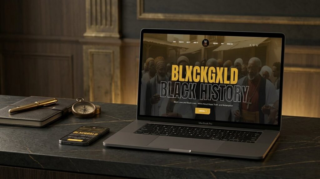
BLXCKGXLD is a Scripture-based content creation collective based in Atlanta, positioning itself as the “Best Christian Content Agency in Atlanta.” It explores the rich heritage and spiritual traditions of the ancient Israelites — with a focus on Northeast African origins and the scattered Israelite communities across global nations.
The brand operates across writings, audiobooks, art, music, commentary, and a physical shop — bound together by a single editorial voice that is scholarly, contemplative, and rooted in faith.
02 — BRAND PILLARS
| Editorial focus | YHWH-Centred, Scripture-Led |
|---|---|
| Audience | Hebrew Israelite + Scripture Community |
| Channels | Writings · Audiobooks · Art · Music · Shop |
| Site sections | Home · Projects · Beliefs · About · Writings · Shop · Contact |
| Featured study | The Book of Gad the Seer |
03 — THE CHALLENGE
A multi-disciplinary collective working across history, theology, art and commerce needs a single home that can hold all of it without feeling like a content dump. BLXCKGXLD needed a site that could position the brand with the gravity of a publishing house, the depth of a research library, and the warmth of a community space — all in one place.
The work also had to handle real commerce (shop + wishlist), house a growing body of long-form writings, and route visitors into the right kind of conversation: scholar, reader, listener, buyer, or member.
04 — WHAT WAS BUILT
- 8-page brand site: Home, Projects, Beliefs, About Us, Writings, Shop, Contact, Account
- Writings hub for long-form historical and theological content
- Featured study module for The Book of Gad the Seer
- Integrated shop with wishlist functionality
- Audiobook and creative project showcases
- Beliefs section as brand-positioning architecture
- Multi-channel social integration (Instagram, X, YouTube)
- Conversion paths: Learn More, Let's Talk, Chat With Us
05 — THE APPROACH
The visual system was the first decision: BLACK and GOLD, literally — the brand name encodes its own palette. We leaned into that as a sign of confidence rather than decoration. Black as the ground, gold as the signal, cream as the breath between them.
The information architecture was designed around intent rather than format. Someone arriving from a podcast doesn’t want the same path as someone arriving from the shop — so the site routes by purpose, not by file type. The Beliefs section sits as a brand-positioning anchor: every other page reads against it.
The editorial voice — authoritative but welcoming — was carried into the UI with serif display type for gravitas, sans-serif body for readability, and generous negative space to let the imagery and language breathe.
06 — VISUAL IDENTITY DIRECTION
Serif display for gravitas / Modern sans-serif for body
Editorial weight meets contemplative spirituality. Black ground, antique gold signal, parchment breath. Imagery-led — historical photography, manuscript textures, faces. Reads like a publishing house, not a content site.
BUILDING A BRAND THAT NEEDS TO HOLD WEIGHT?
Mission-led organisations need sites that match the gravity of the work. Strategy-led builds. One developer, end-to-end.